(Un)Readability, Script and Visual Language with Xu Bing 只可意會,不可言傳:訪問徐冰
Edited & Translated by the fête chinoise team
Images by xu bing studio, instagram, The Metropolitan Museum of Art & The Museum of Modern Art
AS FEATURED IN EDITION NO. 4 OF FÊTE CHINOISE MAGAZINE


Xu Bing, Book from the Sky, 1987–1991 | National Gallery of Canada.
photo provided by xu bing studio
THE FUTURE OF CHINESE SCRIPT
IN ART/CHINESE IN GLOBALIZED WORLD

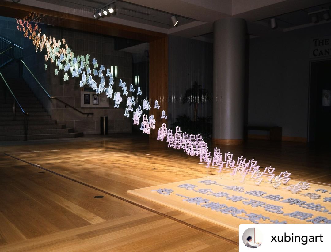
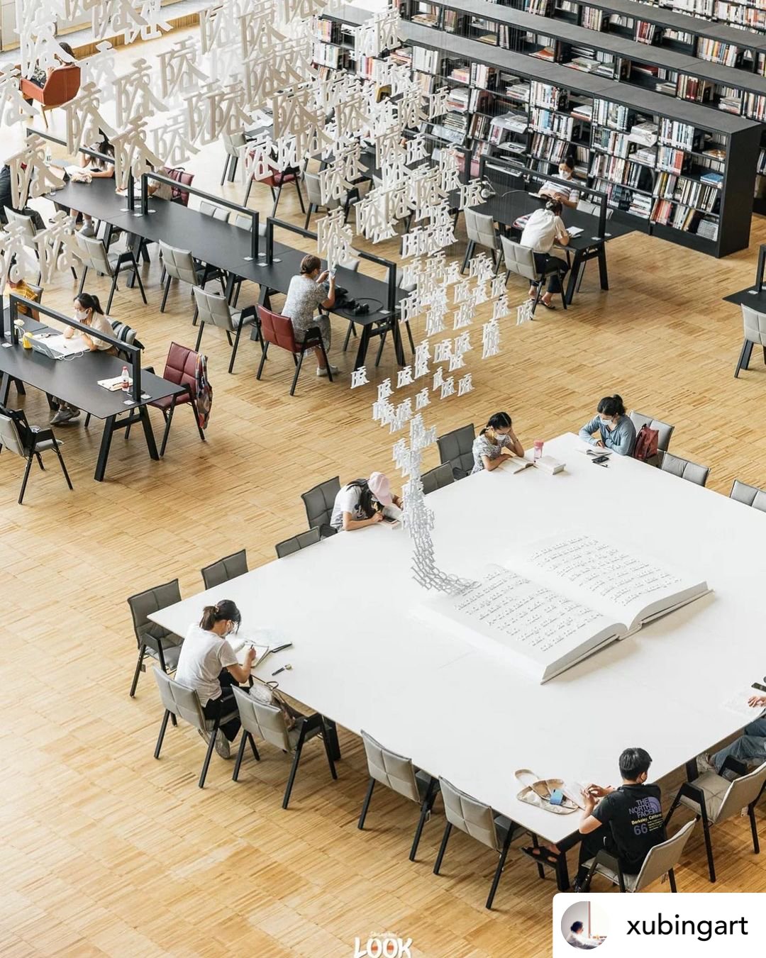
Xu bing, living words, 2022 | Shanghai Library East Hall.
Photo reposted from instagram @xubingart
我認為中國文化與象形文字的源起及演變過程有極大關係。為什麼這麼說?比喻中文的閱讀與英文也是不同的。雖然漢字已經從象形演變成了表意的現代漢字,但核心部分的圖像邏輯依然存在,並與平日的閱讀、思維、觀看構成了一種奇妙的關係。我特別喜歡門閂的「閂」字。一個門中間一個橫真的是在是太有趣、太智慧了,簡直任何人都能看懂。《地書》看上去是超地域的、當代的、新科技的。參與的是西方最前沿的展覽。但我知道,其核心的靈感來自中國象形文字的傳統,中國人最能閱讀圖形,我有這個傳統,才對象形符號(現代標識)這事敏感。

Xu Bing, Book from the Sky, 2022 | the Museum of Pudong.
Mixed media installation/hand-printed books and scrolls printed from blocks inscribed with "false" Chinese characters.
Photo reposted from instagram @xubingart
FAVOURITE WORK & EXPLANATION
Some of my works include “text” that cannot be read (such as “Book from the Sky”) and text that are not words but can be read by anyone (such as “Book from the Ground”). These foreign “words” have much in common: they challenge notions about the level of education involved in reading and they both attempt to erase cultural differences. Usually words convey ideas, expressions, and communication. But my “words” rely on the inability to communicate, intentional misunderstanding, and unexpected confusion to be effective. My “words” don’t belong in a convenient order (like a dictionary of sorts), they’re more like a puzzle for the mind. There is a demand for conversion from readability to unreadability that challenges one’s established ways of understanding. In the process of finding new ways of understanding, one’s mind grows more aware of cognition and comprehension. This is the effect of my “words.”

Xu Bing, Book from the Ground design, 2007.
photo provided by xu bing studio
我的作品裡有些很像‘文字’卻不能讀(《天書》),有些明明不是文字卻誰都能讀(《地書》)。這些異樣的‘文字’有著共通之處:他們挑戰知識等級,試圖磨平地域文化差異。通常文字通過傳意、表達、溝通起作用,但我的‘文字’卻是透過不溝通、誤導、混淆起作用。我總說,我的‘文字’不是好用的字庫,更像電腦病毒,卻在人腦中起作用 — 固有的思維模式和知識概念在可讀與不可讀的轉換中、在概念的倒錯中被打亂,製造表達的障礙,思維的惰性也受到挑戰。在尋找新的依據和渠道的過程中,思想被打開更多的空間,警覺文字,找回認知原點。這是我的那些‘文字’的作用。

Sponsored by FERRIS WHEEL PRESS

Xu Bing, Art for the People for The Met, 2020.
Image from The Metropolitan Museum of Art
Take the example of “Square Word Calligraphy”, the four square-blocks on the cloth seem to be Chinese, however they are actually English words. The upper part of the first word is an A, below is the R and T; together they from the word “ART.” The second word is made up of the letters F, O, and R to make “FOR.” The third word has T in the middle, with H and E on the side to spell “THE.” And four and last word has a P on the left, and then E, O, P, L, E on the right side going downwards to spell “PEOPLE.” As a phrase, it reads “Art for the People” but it was using the Chinese-method of writing order (from left to right, from top to bottom, from the outside to the inside) to read the English words. This is a kind of mask – a disguised text – appearing to be Chinese but inherently it has nothing to do with Chinese and is completely English. I juxtaposed two completely different writing systems (Chinese and English), in a pseudo-arranged marriage no matter how incompatible they appear to be.

Xu Bing, Art for the People for The Met, 2021.
Photo reposted from instagram @xubingart

XU bing, Art for the People, 1999 | at the entrance of Museum of Modern Art, New York.
photo provided by xu bing studio
以這件《新英文書法 Square Word Calligraphy》的作品為例,布條上這四個方塊字看起來是中文,實際卻是英文。第一個字上面部分是一個 A,下面是 R 和 T,拼出來就是 Art;第二個字 F、O、R → for;第三個字中間是 T,兩邊分別是 H 和 E → the;第四個字,左邊是 P,右邊從上向下讀是 E、O、P、L、E → ‘people’原來它們是英文 — “Art for the people”,藝術為人民。只要按漢字從左到右、從上到下、從外到內的順序,就可以讀出一個英文詞來。這是一種帶著面具,經過偽裝的文字;看上去和中文一樣,其內核卻與中文毫不相干,是徹頭徹尾的英文。我把中文、英文這兩種截然不同的書寫體系硬是給弄一塊兒了,就像包辦婚姻,不合適也得合適。
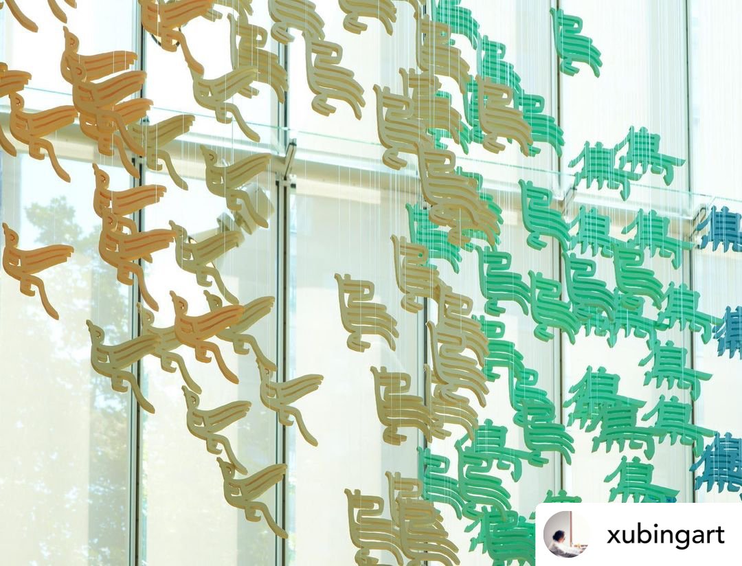
xu bing, Living Word, 2001 | Arthur M. Sackler Gallery.
Photo reposted from instagram @xubingart
Based on the pictographic nature of Chinese characters I also developed installation works, one of which is called “The Bird Flew.” This work consists of the character “bird” made up of more than 500 different fonts. In the exhibition hall, the floor has a text that explains what the word “bird” means: “Bird, vertebrate animal, warm-blooded, uses lungs to breath, covered with feathers, walks on hind limbs, generally front limbs are wings, can fly.” (I think to myself though that birds wouldn’t quite like this description of their species; they would probably retract into nature.) This text begins with the “bird” character flying, and reflects an evolution of the character from simplified script to a traditional print font, regular script, official script, etc., until it finally returns to the most original ancient hieroglyphic way of writing the word “bird.” Together, they fly through the window. The installation was colourful, vibrant, and fairytale-like.
xu bing, Living Word 3, 2011 | The Morgan Library & Museum.
Photo reposted from instagram @xubingart
我在漢字象形性的基礎上,還發展出一些裝置作品,其中有一件叫《鳥飛了》。這件作品由五百多個不同字體製成的‘鳥’字組成。展廳地面上有一篇文字,取自字典上關於‘鳥’的解釋,是這樣寫的:“鳥 niao,脊椎動物的一類,溫血卵生,用肺呼吸,全身有羽毛,後肢能行走,一般前肢變為翅,能飛。”(我想,鳥們是不會喜歡這樣的對他們的描述的,它們一定想離開它,回到自然中去。)以這篇文字為起點,‘鳥’字開始飛起來,從簡體印刷體向繁體印刷體、楷書、隸書、小篆一路演變,最後追溯到遠古象形文字的‘鳥’,成群地飛向窗外。這件裝置色彩艷麗,給人一種童話般燦爛和魔術變換的感覺。

Joseph Kosuth, One and Three Chairs, 1965
Image from The Museum of Modern Art
The work leads the audience to consider the movement between words, ideas, symbols, and images. Juxtapose how “The Bird Flew” uses Chinese characters and its relationship with nature to another installation by representative Western artist Joseph Kosuth (1945–p.). His “One Chair and Three Chairs” uses a real chair, pictures of a chair, and English definition of chair next to one another, which could only be understood in a comparative framework because the English word “chair” and its relationship with the object (a physical chair) are not visually connected. But in Chinese, the character for “bird” is actually visually connected and cannot be separated from the appearance of a bird. This juxtaposition allows us to see distinctions between cultural foundations.

Photo reposted from instagram @xubingart
作品引導觀眾在文字、概念、符號及形象之間展開思維運動的空間。作品用中國文字的象形性與自然的關係與西方觀念藝術的代表作,約瑟夫庫索斯(Joseph Kosuth, 1945–p.)的《一把和三把椅子》(One and Three Chairs)做一種有趣的對比。這件作品是將真實的椅子、照片的椅子和英文解釋椅子的文字,一字排開地對比 — 也只能形成這種對比,因為英文與所表達的物象間沒有視覺上的直接聯繫。但是在漢字中,‘鳥’字與鳥的造型在視覺上,是分界不明的關係,不知道在哪兒就被轉換了。這個比對讓我們看到,不同文化在基本元素上的區別。

Xu Bing, Gravitational Arena, 2022 | the Museum of Art Pudong.
Photo reposted from instagram @xubingart
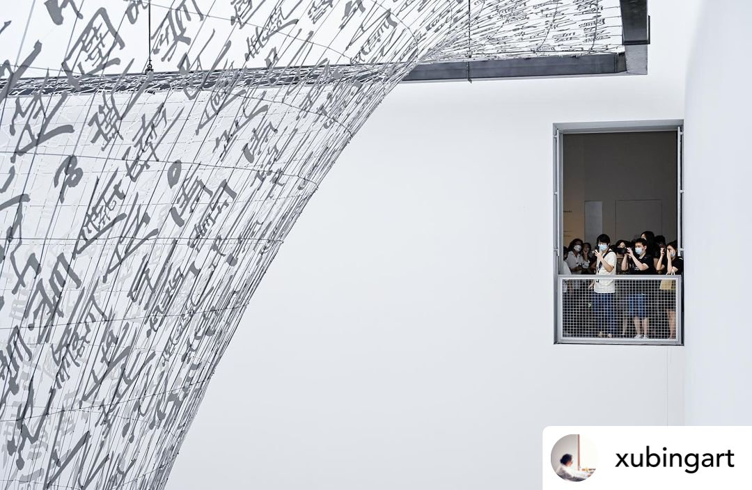
Xu Bing, Gravitational Arena, 2022 | the Museum of Art Pudong.
Photo reposted from instagram @xubingart
FUTURE IN CANADA AND THE WORLD
I hope that my work welcomes audiences and that they feel that they can approach the work. Above all, I hope that when the audience enters the exhibition they can feel that the work inspires their minds. I hope to have more exchanges with Canadian audiences, art circles, and cultural circles. I had a solo exhibition in Canada before, but if there was the opportunity to create something richer and more complete for Canadian audiences, it would be wonderful.
我希望我的作品是平易近人的,是歡迎觀眾進來的。但並非僅此而已,我希望當觀眾進入以後會感受到,原來這件作品是與眾不同的,對人的思維是有啟發的。其實我非常希望能透過作品與加拿大的觀眾和藝術圈、文化界有更多的交流。過去我曾經在加拿大展出個別的作品,但是假如有機會把更豐富、完整的創作帶給加拿大的觀眾,我想會是非常棒的一件事。
Xu bing, living words, at Shanghai Library East Hall.
Photo reposted from instagram @xubingart
I discovered that an artist's job is actually to create an enclosed circle that reflects his artistic world. Former works dialogue with newer works, creating an unlimited future. This circle allow others to see what was already existing in former objects that reflect the artist’s own qualities, such as their ideology, methodology, and cultural foundation. To put it another way, an artist must consider what their purpose is, what their relationship is with society and culture. In my opinion, the significance of art is not whether it looks like art but whether it provides people with a new perspective.
我發現其實一個藝術家的工作是再製造一個反映他自己的藝術世界的封閉圈。過去的作品可以作為對後來作品的註釋;而後來的作品又可是我沒有窮盡的。讓人們看到過去作品中已經存在的、屬於這個藝術家的特質,如思想、方法,以及文化的基因。具體說就是:身為一個藝術家,在這個世界上是幹什麼的,他與社會、文化之間的關係是什麼。在我看來,藝術重要的不是它像不像藝術,而是看它能否給人們一種觀看事情的新角度。


SPonsored by FERRIS WHEEL PRESS
RELATED ARTICLES


From April 11 to 13, the Grand Quay in Montreal’s Old Port will host the highly anticipated 2025 edition of Plural, Canada’s leading contemporary art fair. Formerly known as Papier, the fair began with a focus on works on paper and has since evolved into a reimagined event that reflects the multiplicity of voices, practices, and mediums shaping contemporary Canadian art. Amongst the standout projects is Like raindrops rolling down new paint, Karen Tam’s evocative work, presented by The National Bank and staged in the Espace Banque Nationale.