Fading Treasures: The Elegance of Hong Kong's Hand-Lettered Signage 褪去的珍寶:香港手寫手製招牌的魅力
Chinese 中:Sannie Chung · English 英: Translated by Linda Wai Ling Tse
Photography by Romain Jacquet-Lagrèze
www.romainjl.com | @romainjacquetlagreze
As featured in 2024 Fête Chinoise Design Annual
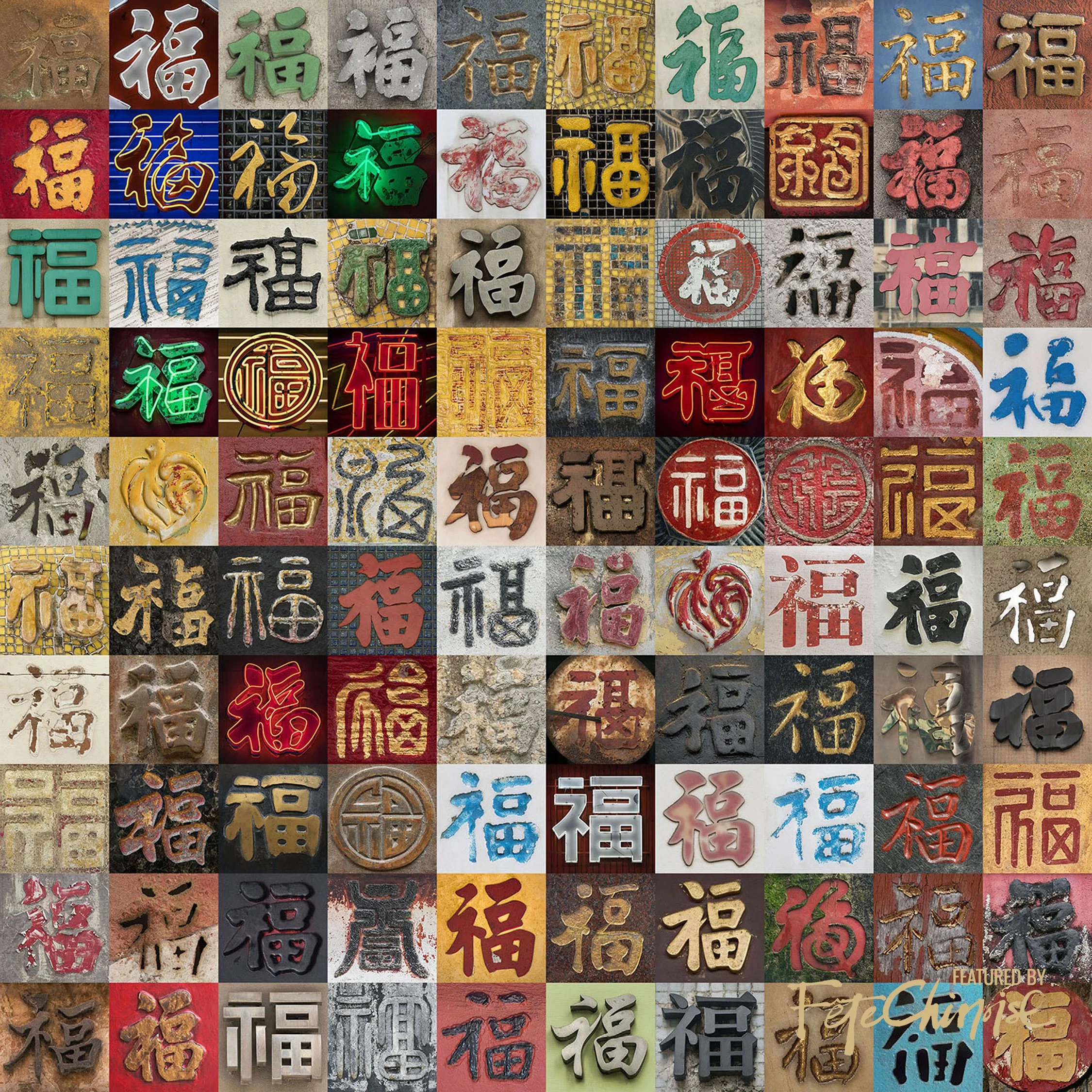
'Hundred Fortunes - 百福全圖' by photographer Romain Jacquet-Lagrèze
"I am especially happy that 'Hundred Fortunes - 百福全圖' was exhibited in the Hong Kong Museum of Art in 2022 and 2023 as a part of the exhibition 'By the people'.
The most recent one is 'The Ingrained Bond' that I just finished a month ago. For this collage, I have been gathering hundreds of the characters ‘心’ (Heart) in the streets of Hong Kong. I selected my favourites ones and gathered them in order to write the character ‘愛’ meaning Love. Each of these characters symbolizes a person with a beating heart, we are all trying to make sense of our life and the underlying meaning that connects us all is Love." — Romain Jacquet-Lagrèze
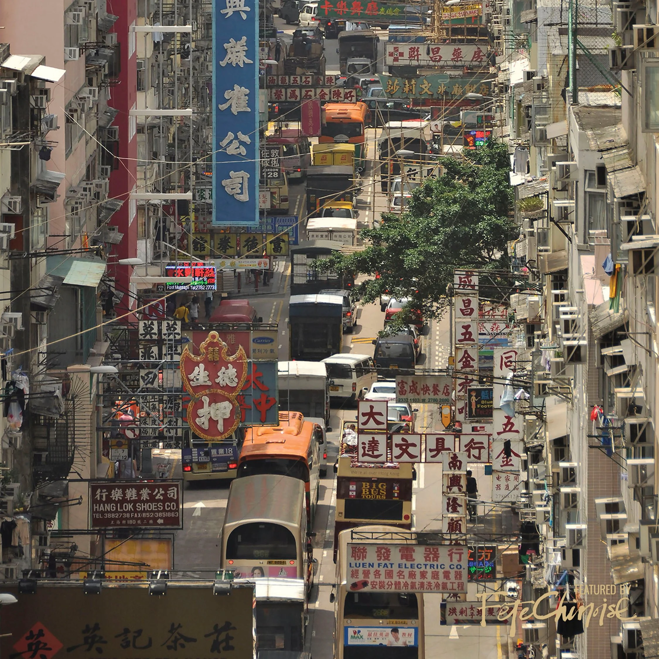
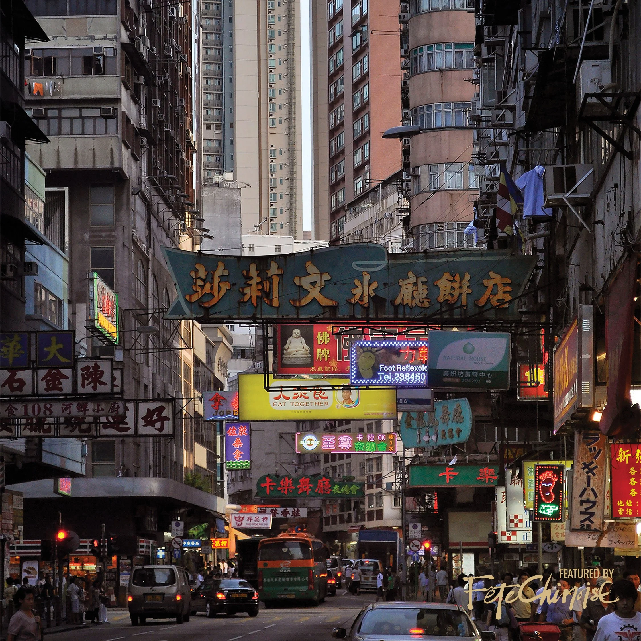
In films set in Hong Kong or inspired by its vibrant streets, hand-written Chinese character signs often serve as prominent features. Unlike mainland China's preference for simplified characters or Taiwan's widespread use of plastic signs, Hong Kong's oldest storefronts proudly display hand-painted lettering, embodying a unique charm that filmmakers strive to capture. These signs, with their graceful strokes, have become iconic symbols of the city's culture, offering a nostalgic glimpse into its bustling urban landscape.
荷里活電影中凡出現手寫漢字招牌的畫面,大多從香港街道取景。 因為中國內地常用簡體字書寫,台灣雖然也通用繁體,但卻用美感崩壞的台式中空塑楞板作招牌;相比之下,香港街頭舊招牌以手寫書法題字,有別於千篇一律冷冰冰的電腦打印,充分體現出香港的個性和特色,成為這座城市文化的重要標誌之一。
During the 1960s, Hong Kong experienced a golden age of handcrafted signage, symbolizing an era where the intimacy between hand and craft flourished. These signs, beyond mere markers, acted as my navigational aids in the intricate streets of my birthplace, extending from the island to the peninsula across Victoria Harbour. Each sign possessed a human touch, resonating with the unique personality and artistic flair of its maker, evident in the rhythmic strokes of paint.
From the 1940s to the 1970s, the streets of Hong Kong were graced with the iconic «Hong Kong Bei Wei Style» font, renowned for its bold lines that bestowed every storefront with visual impact and artistic charm. Wandering through the narrow alleys of Central and Sheung Wan, one cannot overlook these relics of yesteryears, each sign bearing witness to the skill and storytelling prowess of its creator. Beyond language barriers, these graceful calligraphic strokes infuse the cityscape with authenticity and individuality, offering a glimpse into its vibrant history and cultural legacy, a place many Canadians of Asian heritage still fondly consider home.
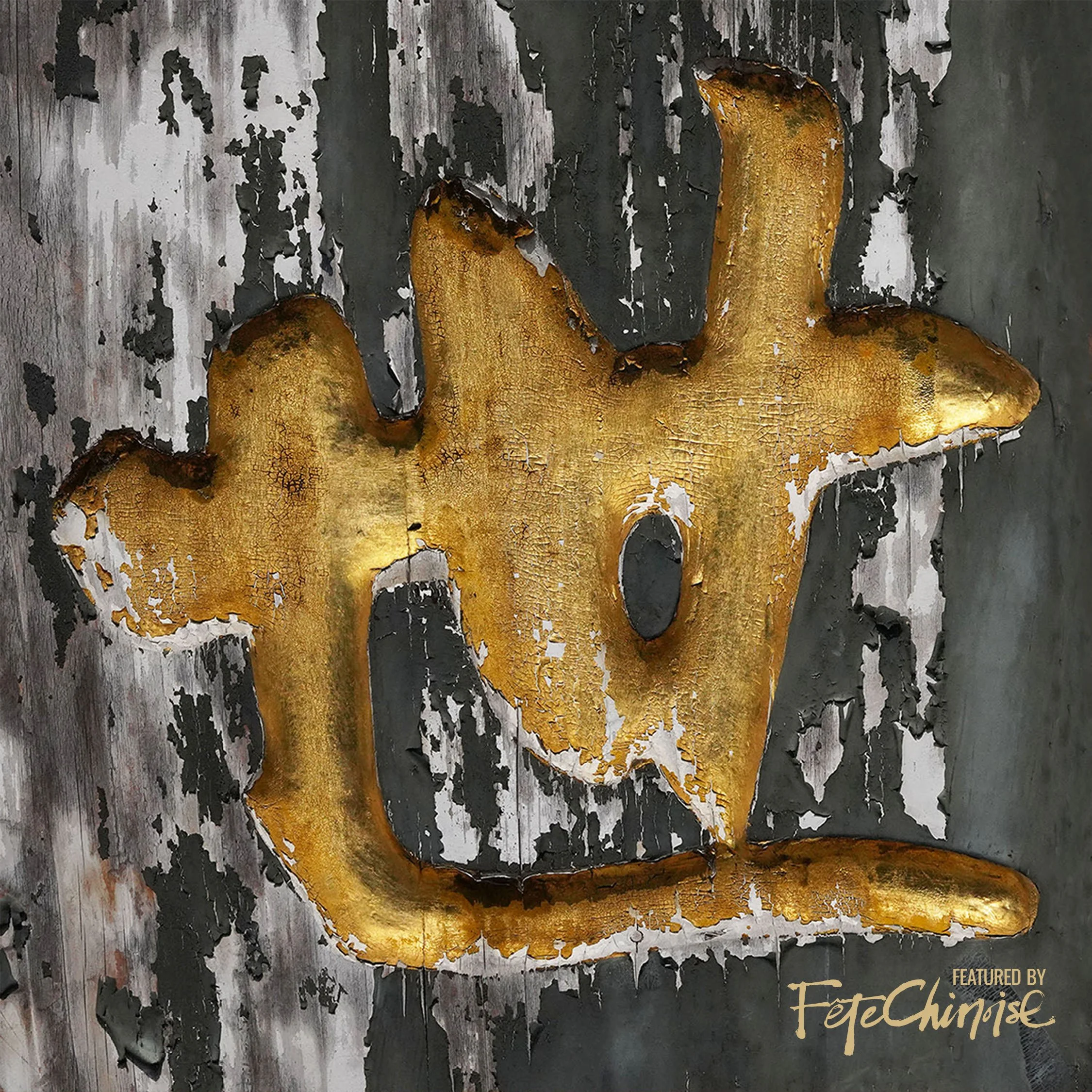
'Walk' (行)
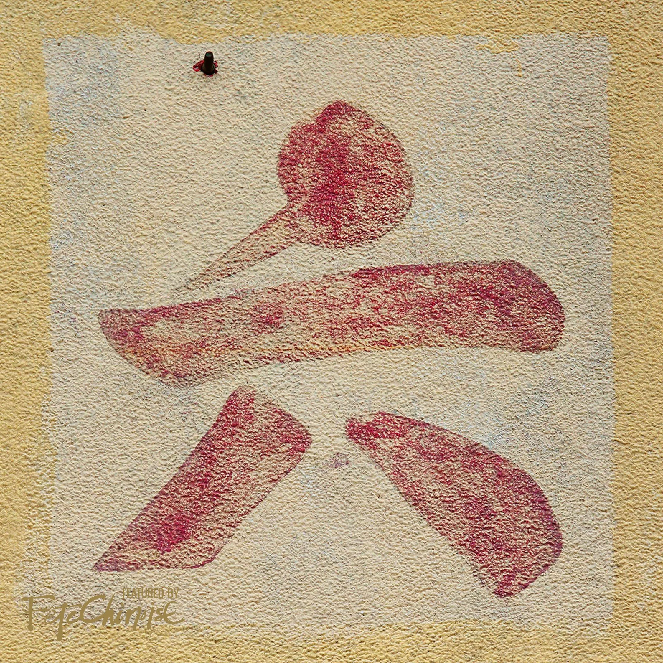
'Six' (六)
1940至1970年代香港常見街招字體為「香港北魏體」,線條清晰、方正飽滿且強而有力,給街道带來了視覺上的衝擊和美感,每個招牌都是一件藝術品,講述不同故事,展現不同風格。走進中上環的小巷,四周都是舊殖民時代建築物,街角迎來一個中文書法招牌,不論你是否認識中文,招牌上面優美的書法猶如一幅生動的圖案,為小巷增添了一抹獨特的風貌,更為人們打開了一扇通往過去的門。
These hand-painted signs emanate a rich warmth and character, a stark departure from the digital overload of today's world. Amid today's electronic screens and technological clamour, they stand as poignant reminders of a bygone era, when craftsmanship and the human touch prevailed. Each street corner tells its own story, adorned with signs boasting various fonts, materials, and languages, reflecting the vibrant and diverse identity of Hong Kong's multicultural heritage.
Sponsored by Cadillac Canada
書法招牌承載着濃濃的人情味。 在這個數碼化的時代,人們往往被電子儀器和網絡信息包圍,書法招牌則包含着工匠手造的暖意,同時充滿個性。 同一條街、同一個地方,多個不同字款、不同物料、中英夾雜的招牌,每每凸顯香港華洋共處、兼收並蓄、多采多姿的一面。
For business owners, these calligraphic signs transcend mere marketing tools; they represent dedication and ambition. Beyond their visual appeal, these signs fulfill a practical purpose in attracting customers and conveying the pride and aspirations of shopkeepers. Whether it's the inviting «Happy Bakery» or the bustling «Sunny View Cha Chaan Teng» lining Queen's Road East in Central or Wan Chai, each sign encapsulates the dreams and drive of its owners, offering a glimpse into the entrepreneurial spirit that defines Hong Kong. I vividly recall the handwritten signs of the shops where I selected my first pair of eyeglasses, the aroma of the traditional Chinese bakery, and the tactile sensation of paper at the bookstore. Even during changing times, these signs persist as symbols of resilience and authenticity, bridging the gap between past and present.
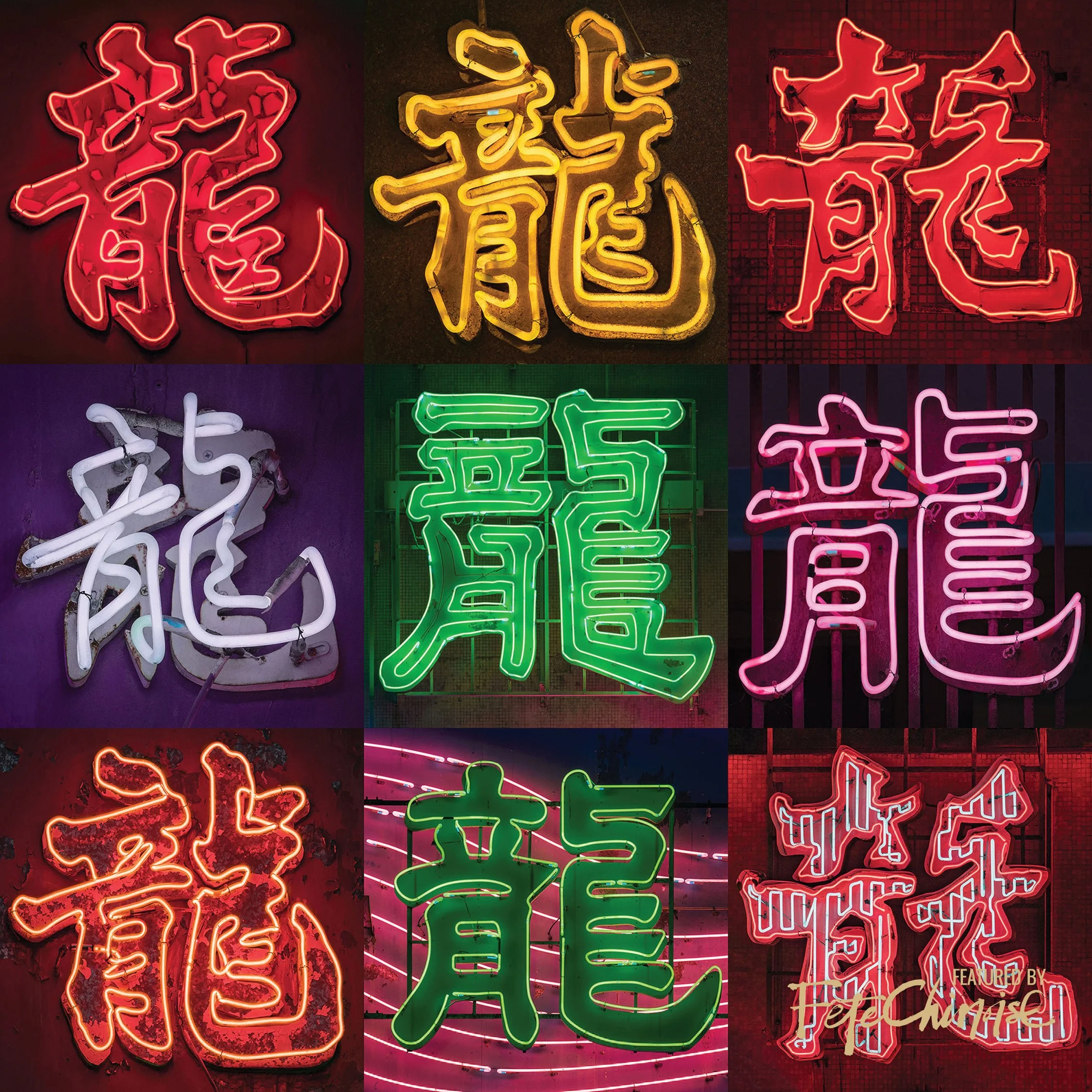
Chinese Character 'Dragon' (龍) in different calligraphy style
這些手寫書法招牌表現出店主的心血和智慧。 不僅能夠吸引路人的目光,有助招攬生意,同時亦包含了店主對自家產品及生意的信心和祈願。 灣仔皇后大道東上,「快樂餅店」及「順景茶餐廳」一左一右並列;每日吃到新鮮出爐的奶油筒、沙翁,下午吃個經濟實惠的茶餐,就是昔日街坊、小市民對於「快樂」、「順景」生活單純而美好的實現。 皇后大道西1號位於皇后大道西與文咸東街交界,「上環有記合臘味家」是香港現存保育最完整、字數最多的水磨石招牌及廣告字,橫幅字款方正大方地寫上詳細店名及地址,樓上三層大樓外牆簡單列出店名「有記合」;招牌產品「金猪」、「臘味」;底下四條方柱端正列出「六十餘年專賣靚嘢」「歷史悠久貨正無欺」等,字字鏗鏘、句句有力,霸氣、直率、簡而精地列出店家童臾無欺、貨真價實的營商之道。 即使過百年歷史,人去樓空,物換星移,現代人亦能從遺留下來的書法招牌,感受到昔日店家的輝煌家業。
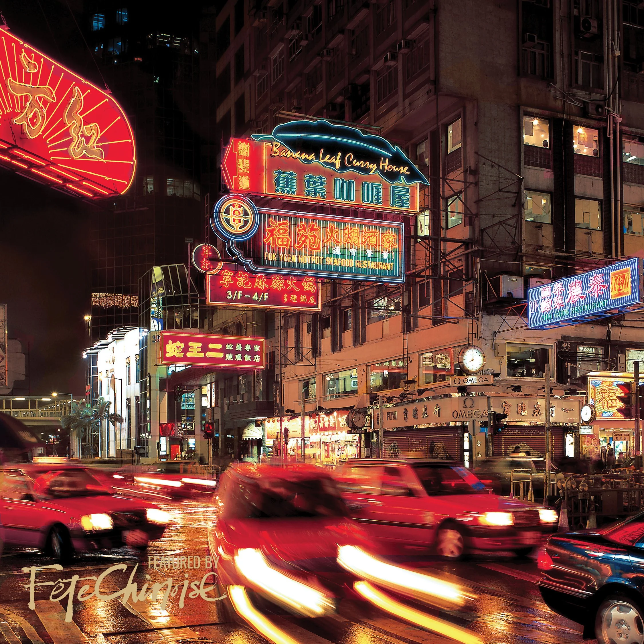
Yet, as modernization charges ahead, the fate of these cultural gems hangs in the balance. Escalating costs and evolving aesthetics threaten to push them into obscurity, much like their neon counterparts.
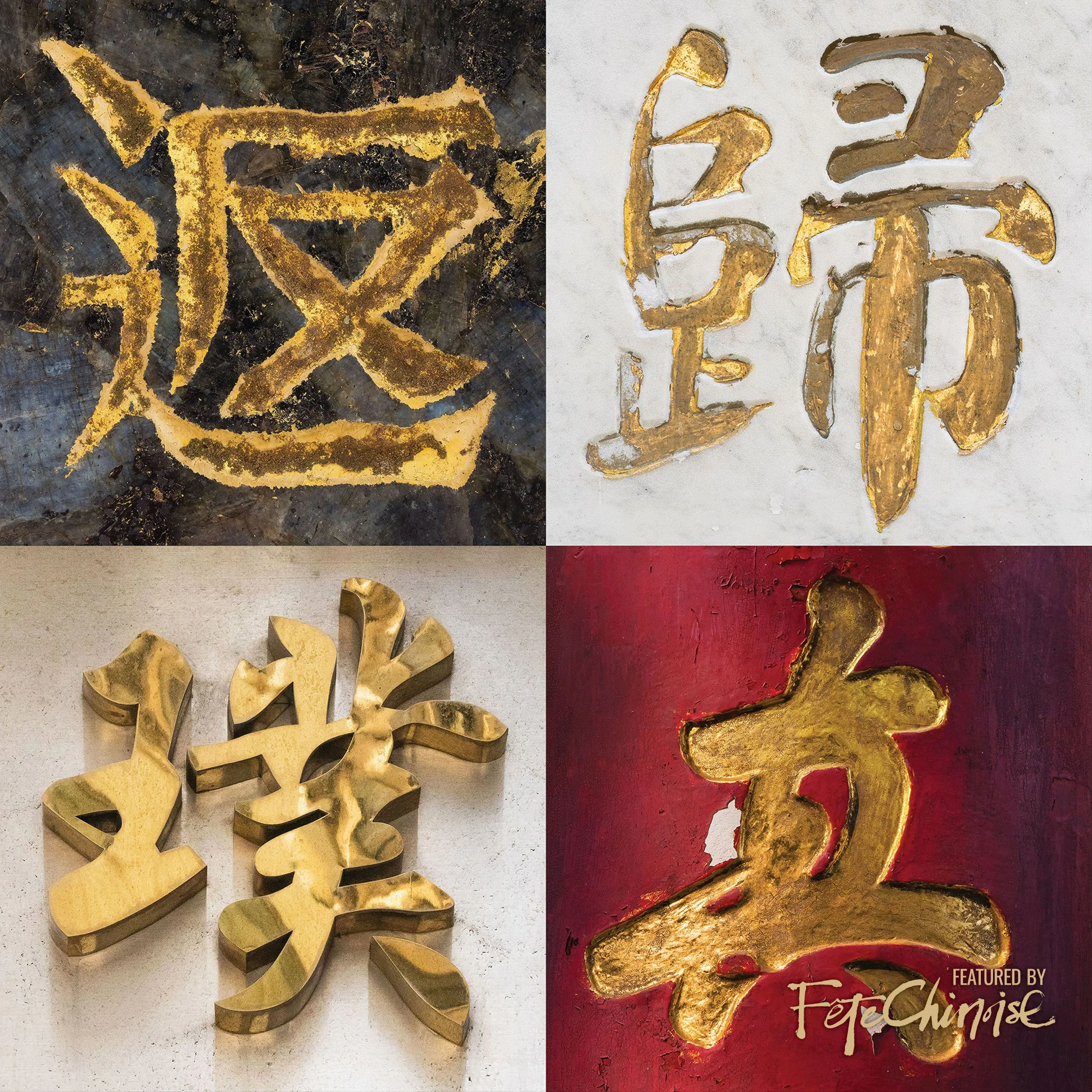
‘Back to Basics’ (返璞歸真)
These signs act as vital links to our heritage by preserving traditional culture through their unique designs and historical significance, connecting us to the past. We must cherish and safeguard them for future generations to appreciate, learn from, and connect with their cultural roots.
時代不同了,書法招牌可能因為成本、審美、潮流改變而日漸被淘汰。 然而,我們不能忽視它的獨特魅力、歷史文化價值,是傳承和弘揚傳統文化的重要載體之一,希望大眾能珍視這些文化遺產,同時設法保育,延續其生命。
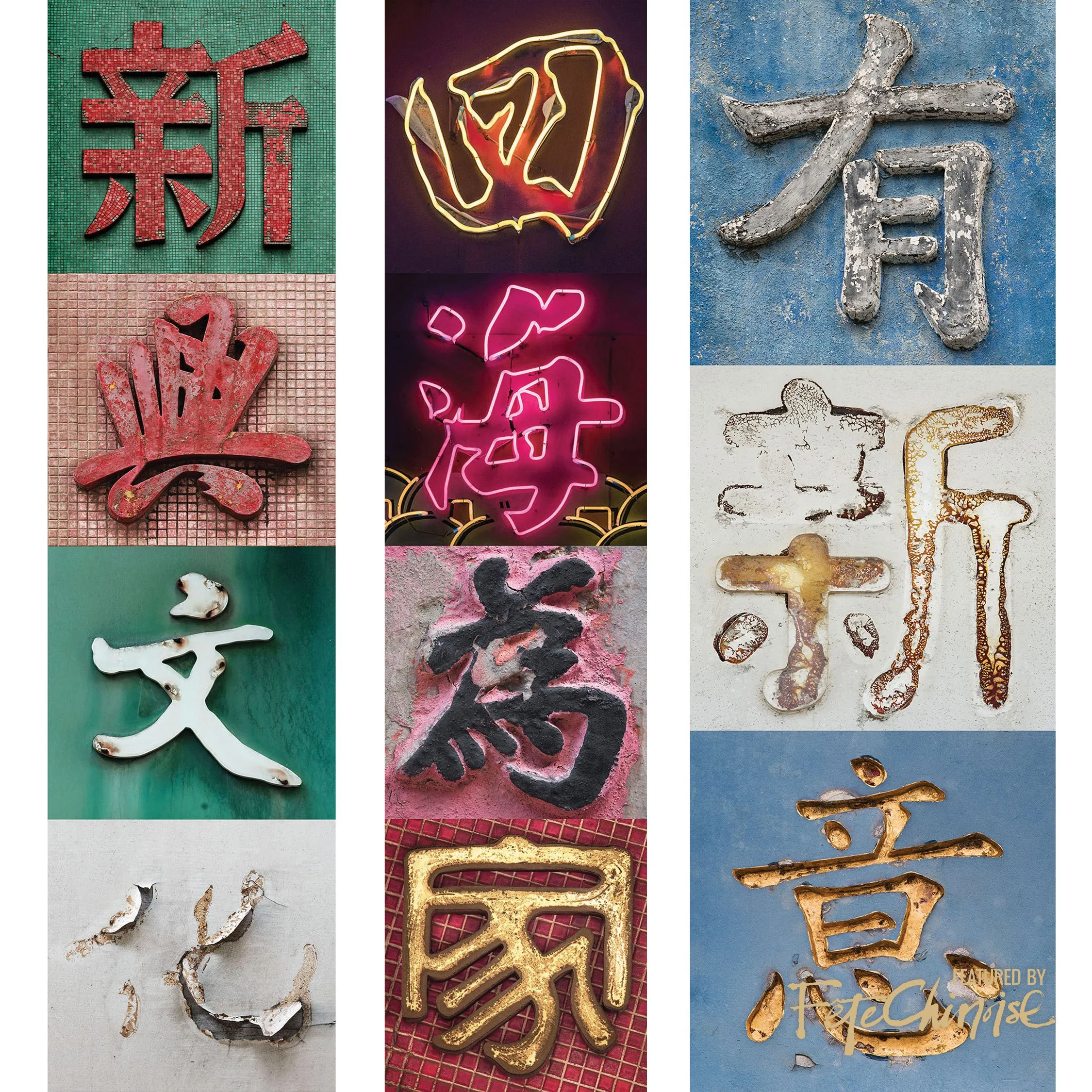
Photographer Romain Jacque-Lagrèze’s ‘City Poetry’ series creates New meaning by collaging characters photographed from various locations.
Artworks by Romain Jacque-Lagrèze are available as Limited Edition prints and single characters are available as Ceramic Tiles at Blue Lotus Gallery, 28 Pound Lane, Sheung Wan, Hong Kong.







In Chinese culinary tradition, the Longevity Peach Bun (or Shoutao), holds a special place. Often found at birthday banquets for the elderly, this delightful treat is more than just a delicious dessert—it is a symbol of health, prosperity, and a long life. With its unique appearance and cultural significance, the symbolic bun continues to be a staple at celebrations as traditions are passed down generations of families in Asia and in diasporas around the world.